Disney | Payment Confirmation Optimization
This project helped encourage Guest’s who are buying tickets at Walt Disney World to do so in a streamlined manor with minimal friction. As a Product Designer, I was responsible for UI/UX design.
Launch Date:
October 2018 (Test Duration: 90 Days)
Platform:
Mobile App (iOS & Android)
Team:
- Product Manager
- Content Strategist
- Web Development Team
- Senior Product Designer
- Product Designer (me)
- Data Analytics Team
BACKGROUND
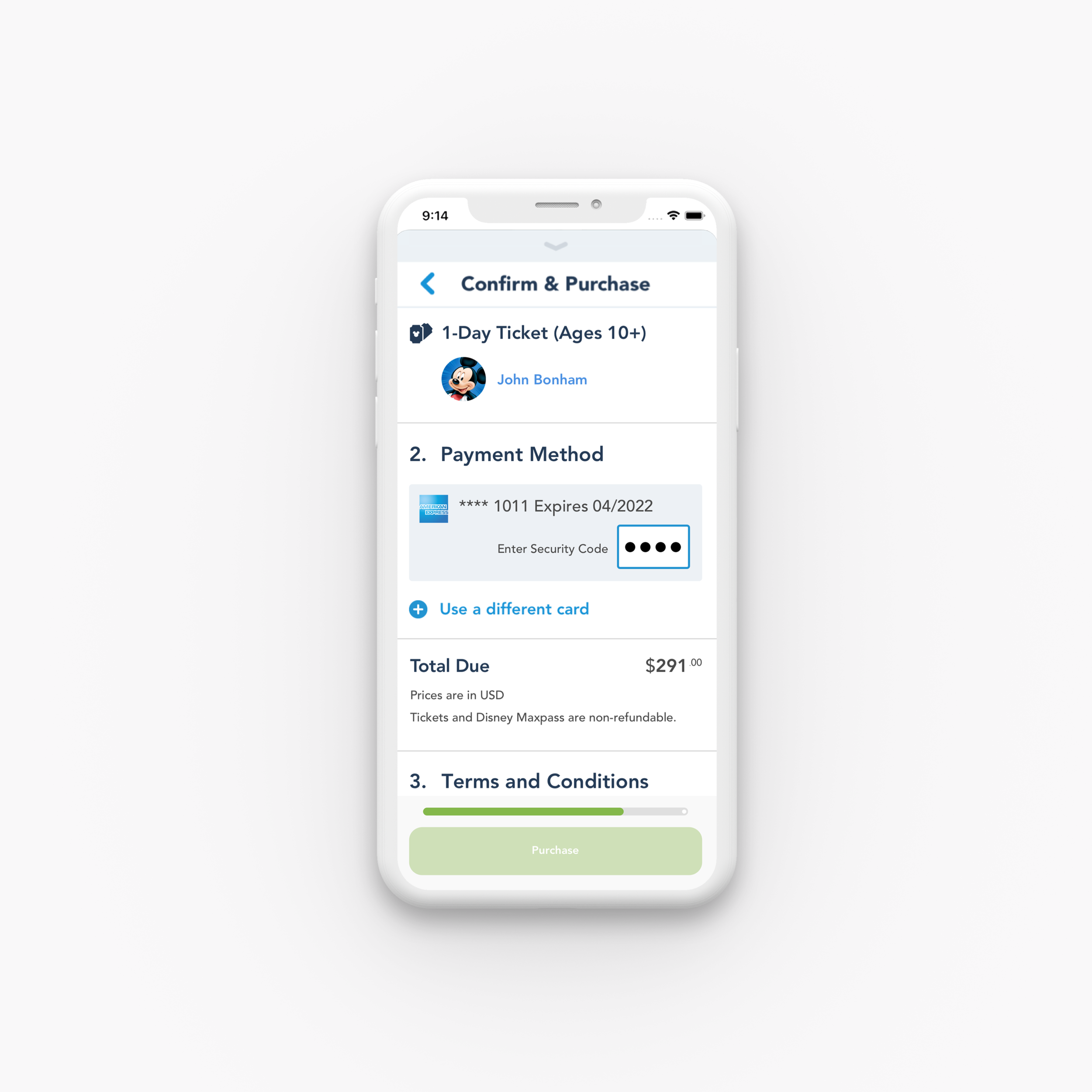
Walt Disney World’s mobile app has a purchase confirmation page for Guests booking tickets.
On the Purchase Confirmation Page—a Guest must assign guests to tickets, adding billing info, agree to terms and conditions, and purchase.

PROBLEM
Guests experience a high error rate when trying to confirm and purchase.
Guests much complete 3 key steps in order to confirm and purchase successfully. However, many Guests skip over these three key steps and try to purchase anyway and receive errors.
Guest’s Skip Over:
Assigning tickets
Adding security code
Agreeing to terms and conditions

OPPORTUNITY
Make it easier for the Guest to understand how to complete the necessary steps to purchase.

GOALS
Leverage AB Testing to uncover the most ideal payment experience for Disney Guests.
1.
Increase conversion rate
2.
Decrease error rate
3.
Decrease cart abandonment rate
4.
Decrease time on page
DESIGN PRINCIPLES
Intuitive.
Make it clear and understandable of what action the user needs to take.
Transparent.
Help the user understand where they are in the process at any given time.
Rewarding.
The user should feel accomplished from completing the necessary steps to purchase.
Scalable.
Design a system that can be applied to other Disney payment confirmation screens.
USER JOURNEY
We mapped out the user's emotional journey to ensure every touchpoint of ‘Payment Confirmation’ is encouraging and motivating.

DESIGN ITERATIONS
Concept Explorations
I explored various designs in how to make it more intuitive for the Guest to understand how to complete the necessary steps to purchase, from simple UI updates to new interactive tools like a progress bar.


UXR
Prototyping Experience
After many explorations and reviews, we narrowed down to 3 concepts that we decided to run for AB testing.

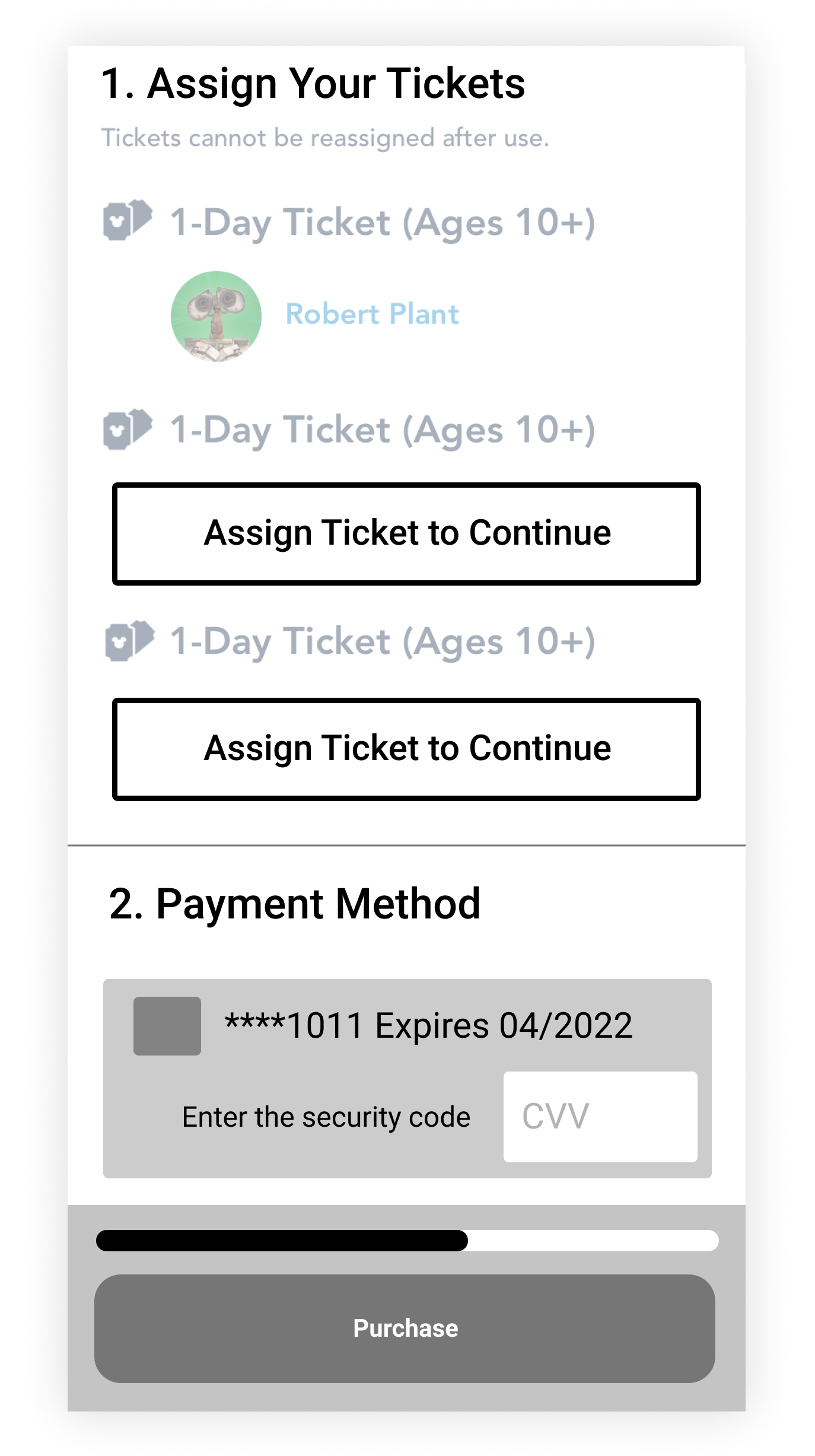
UI Updates
These updates include creating a larger button to assign tickets, and redesigning the entry filed for the security code to reflect the amount of characters are expected.

Stepped Progress Bar
To help the Guest understand where they are in the process at all times, each section is given a number and a docked purchase button and progress bar is added.
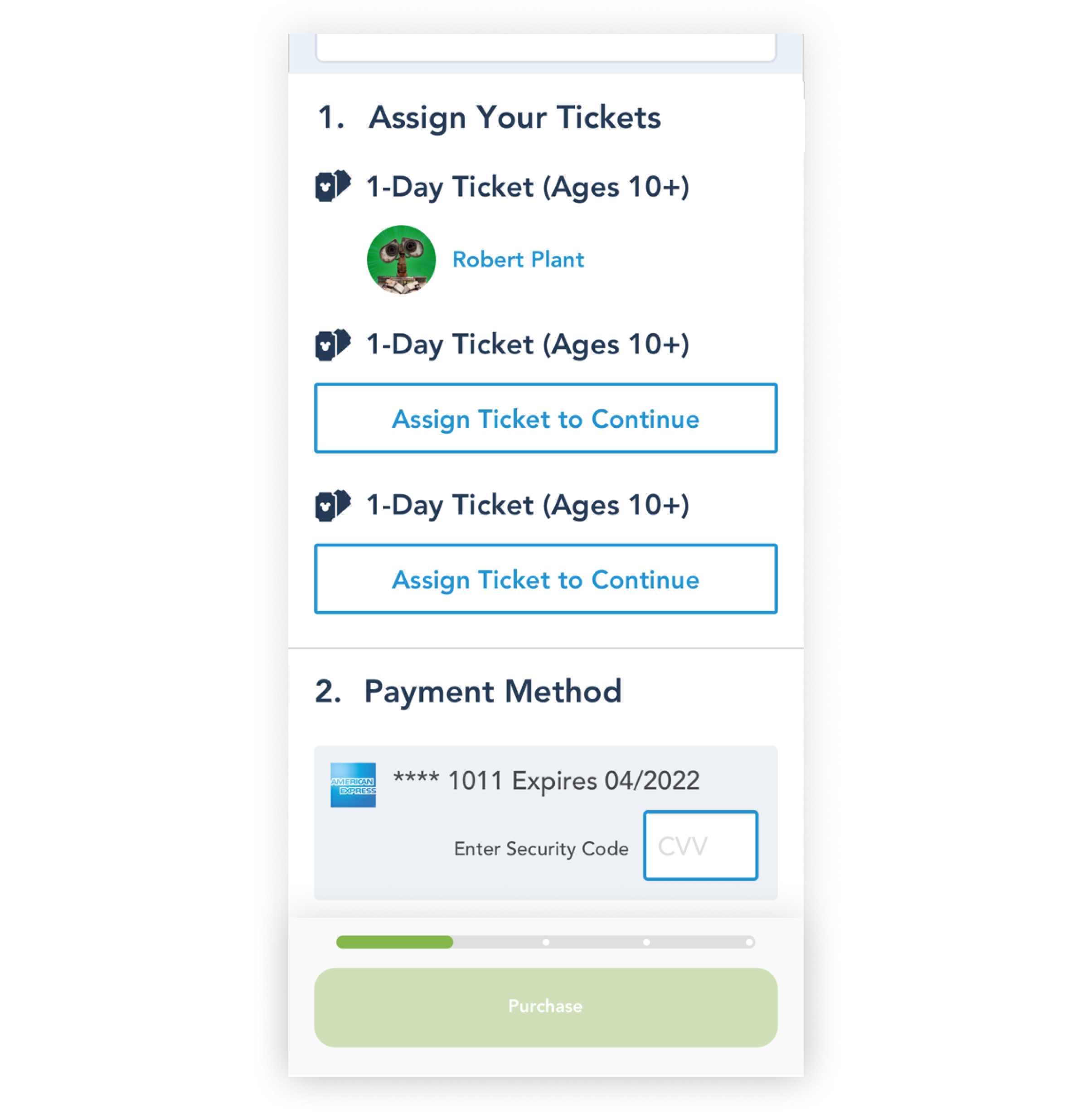
UI Updates + Progress Bar
This variant of the test will incorporate the previous two variants.
FINAL DESIGN
UI Updates
Assign Tickets:
The new treatment out lines the buttons and gives it a primary color treatment to make it intuitive to the user that these are buttons you must press.
Enter Security Code:
The new treatment shrinks the entry field to be a more accurate representation of the amount of characters needed, while giving a primary color outline to make it intuitive to the user that this is a field they must interact with and complete.


Stepped Progress
The docked purchase button will remain inactive until all steps are completed. The progress bar will reflect the color of the purchase button, and have dots within it to make it clear how many steps are needed.
UI Updates + Progress Bar
The previous two variants will be coupled together.
Baseline UX.
After a Guest adds tickets to their cart arrives at the Confirm and Purchase screen, they will assign tickets to guests, add shipping/billing info, agree to terms and conditions, and purchase. The progress bar will have 4 states to follow the Guest through their journey.

TEST RESULTS
UI Updates + Progress Bar improved UX and business metrics
The three variants were tested across 20% of the mobile app for 90 days to understand which variant inspired more conversions and decreased error rates. Updating the UI at key touch points and adding a progress bar increased sales and decreased error rates.
increased ticket sales by 3%
error rates decreased by 10%
time spent on page decreased by 10%

KEY TAKEAWAY
Clear steps towards a goal empower users to be more successful.
It was found through the test that Variant C, updating both UI and adding a progress bar, improved success metrics. Executive leadership decided to push the hourglass live to 100% of the audience for mobile. This decision was grounded in the insight that having clearer steps towards a goal empower a user to be more successful in their decision making. Ultimately this test resulted in millions of dollars of additional revenue for Walt Disney World.