

AR Content Creation Tools
Enabling AR creators and clients to have more freedom and control over their design decisions. I was responsible for UI/UX design of these new features.
Launch Date:
February 2020
Platform:
Desktop Web
Team:
- Product Manager
- Creative Director
- Product Designer (me)
- Web Development Team
BACKGROUND
CameraIQ is a creative development software for Augmented Reality Filters published on Facebook, Instagram and Snapchat.
The platform provides basic components to create a custom AR filter. Users can add different components and upload material assets.

PROBLEM
The platform only enables a user to add single layered content in a fixed position.
Users request and expect the ability to position and scale different AR components to varying degrees of range. The platform doesn’t have that capability.

OPPORTUNITY
Give users the tools to order, transform, and render content in Augmented Reality.

GOALS
Leverage these new editing features to mitigate customer service issues.
1.
Increase engagement
2.
Increase amount of AR filters published
3.
Decrease page abandonment rate
4.
Decrease customer service complaints and requests
DESIGN PRINCIPLES
Simple.
Easy to understand how to use
Empowering.
Enable more freedom to experiment and innovate
Engaging.
Make it more fun to adjust content again and again
Scalable.
Design a MVP with with consideration to the future roadmap
USER JOURNEY
We mapped out the user's emotional journey to ensure every touchpoint of AR content creation is empowering.

DESIGN ITERATIONS
Concept Explorations
I explored different concepts on how a user could order different layers of a component as well as position and scale them.


UXR
Prototyping Experiences
After many iterations and reviews, we chose 3 key concepts to highlight —Ordering layers, Transform Controls, and Render Controls.

Order
There will be an order button on the top of the component module, enabling a user to re-order the layers.

Transform
The Transform tab will house scale and position controls.

Render
The Render Tab will house opacity and playback controls.
Interaction Rules
I explored how each editing feature would work from state to state.

FINAL DESIGN
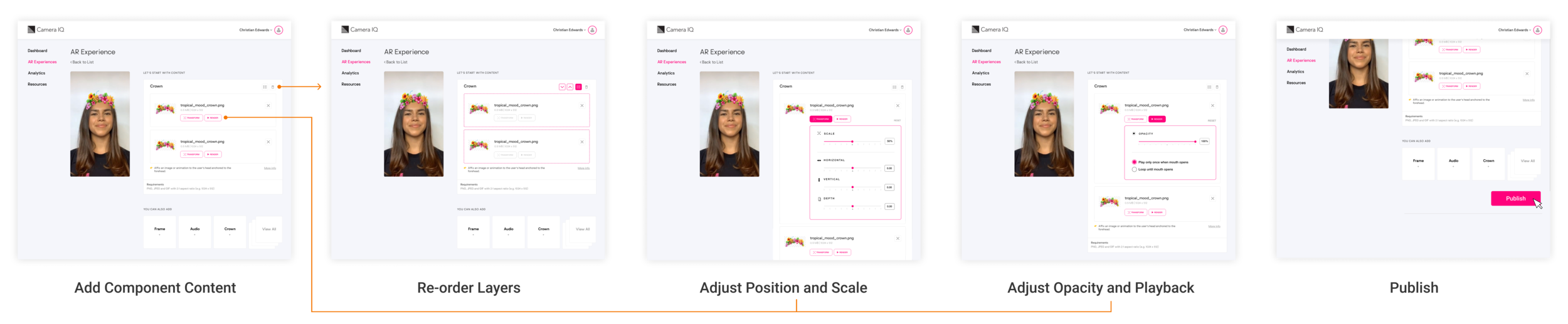
Order Content Layers.
A user can order content by activating the ‘order button’ on the top right of the component— indicating activating with the dotted line. They can then drag and drop, or select and cycle using the arrow buttons.


Transform controls
By selecting the ‘Transform’ Tab, a dropdown panel will expand giving the user the ability to adjust position and scale with sliders or by entering in the number field.

Render controls
By selecting the ‘Render’ Tab, a dropdown panel will expand giving the user the ability to opacity levels with a slider or by entering in the number field. Playback controls can be toggled back and forth with radio buttons.
Baseline UX
The content creation journey enables a user to have more freedom and control over their AR Experiences.
KEY TAKEAWAY
Tools for AR Creators should be simple yet empowering, not restricting.
After launching the new editing features, it was found that users and clients of the platform were more satisfied with the freedom they were given to experiment.
Less customer service requests
More AR Filters created and published
