

Dropbox | Homepage Product Carousel
This project represents one phase of a multi-phase experimentation roadmap that merchandised the homepage of Dropbox.com with new product offerings. As a Product Designer, I was responsible for UI/UX design.
Launch Date:
July 2021 (Experiment Duration: 60 Days)
Platform:
Web & Mobile Web
Team:
- Product Manager
- Content Strategist
- Brand Designer
- Web Development Team
- Data Analytics Team
- Product Designer (me)
BACKGROUND
Homepage of Dropbox.com is a place for visitors to discover and navigate to product offerings.
Dropbox has been acquiring companies and developing new products to offer more than their core product ‘File, Sync, & Share.’

Dropbox.com (homepage)
PROBLEM
As a company with a growing product portfolio, it is hard for visitors to discover these new product offerings.
The homepage does not offer any mechanisms to showcase new product offerings.
User behavior:
Over 60% of traffic does not scroll below the fold of the screen.

OPPORTUNITY
Create more opportunities for visitors to discover new products offerings from the top of the homepage.
For the first experiment, we will enable visitors to discover the new Dropbox Professional + eSign Bundle.

GOALS
Leverage AB Testing to uncover the most ideal product discovery experience for new product offerings.
1.
Increase CTR to product information
2.
Increase Conversion Rate
3.
Decrease bounce rate
4.
Decrease time spent on page
DESIGN PRINCIPLES
Engaging.
Capture the attention of the visitor to discover this new product offering.
Empowering.
The visitor should feel empowered by the content shown to make a decision to learn more about the new product offerings.
Intuitive.
The visitor should understand clearly how to make the next step to learn about the product with hesitation.
Scalable.
Design a system that can be applied to other new products Dropbox will offer in the future.
USER JOURNEY
We mapped out the user journey to ensure every touchpoint of the product discovery experience was encouraging and motivating.

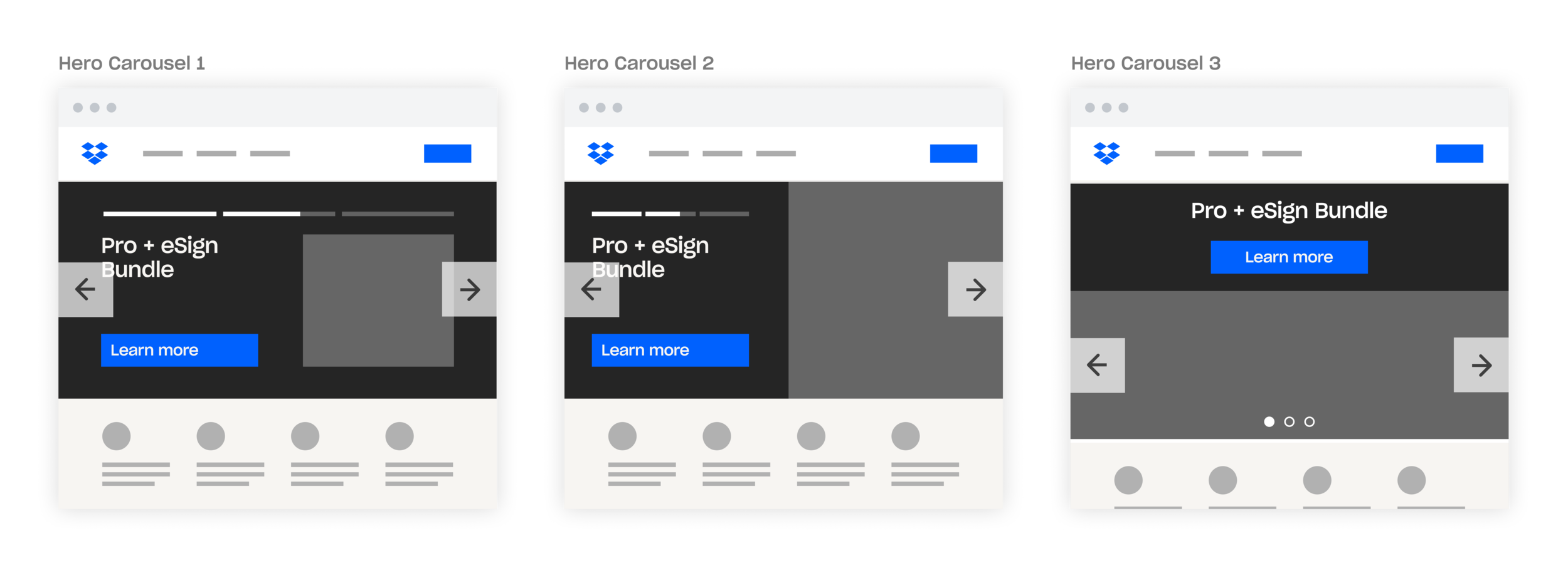
DESIGN ITERATIONS
Concept Explorations
I explored various designs in how to offer visitors an engaging and scalable way to discover new product offerings, from simple UI updates to new interactive mechanisms like a Carousel.

UXR
Experiment Design
After many explorations and reviews, we narrowed down to two variants that we decided to run for AB Testing.

V1: Control
The existing homepage.
V2: Slide 1 - Plans & Pricing
The existing homepage content will turn into slide 1 of the product carousel.
V2: Slide 2 - Pro + eSign Bundle
The Professional + eSign bundle will be slide 2 of the product carousel.
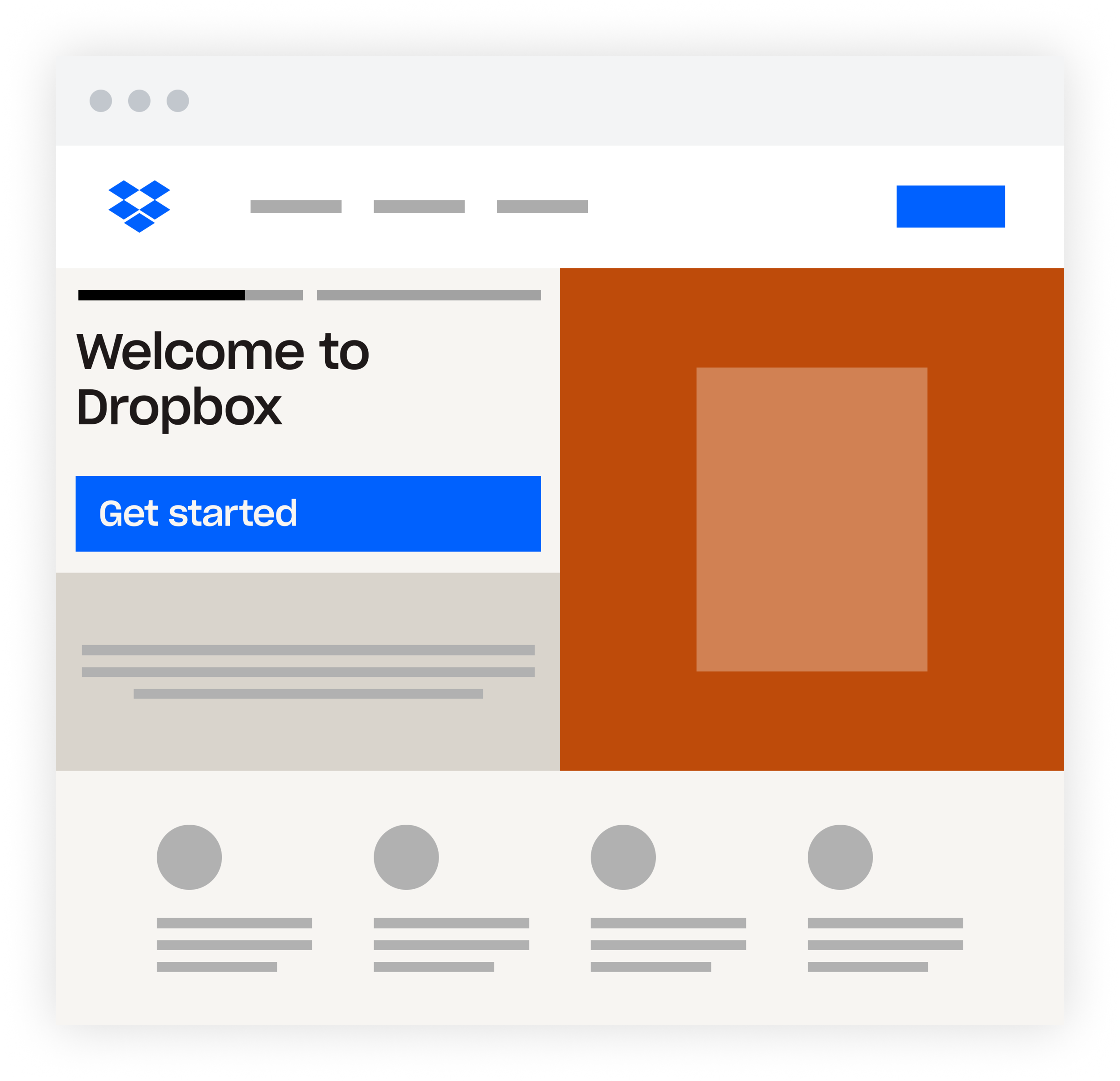
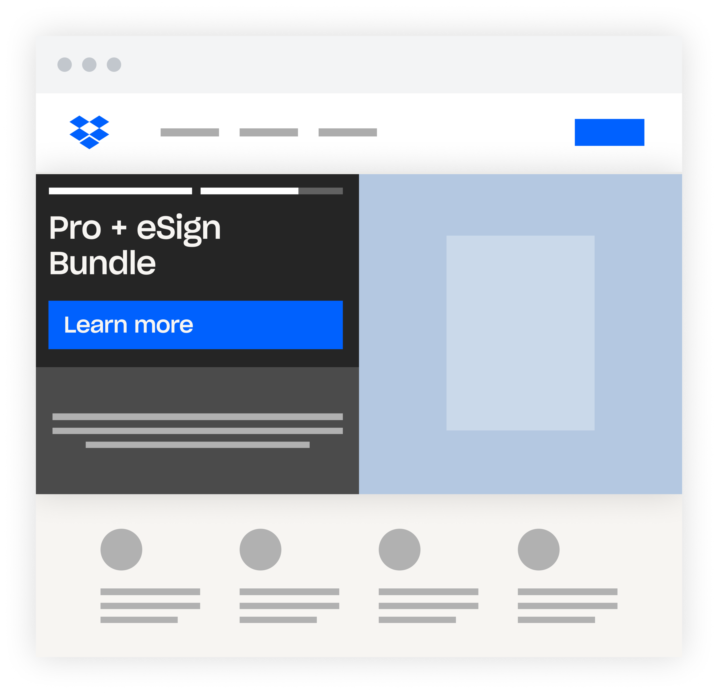
FINAL DESIGN
Product Carousel
The product carousel uses the Homepage Hero Section design, and adds a carousel indicator to the top left panel to indicate to the user that there is more content coming soon. There is a 10 second timer that changes which slide the carousel is on.


Slide 1 (Plans & Pricing)
The first slide of the carousel displays content that will welcome new visitors to Dropbox.com, giving them an opportunity to explore all plans & pricing.

Slide 2 (Professional + eSign)
The second slide of the carousel displays content about the new Dropbox Professional + eSign, giving visitors an opportunity to click to learn more about the bundle.
Baseline UX.
When a visitor first arrives at Dropbox.com, they will see the product carousel. Once they have chosen a path to take, they will have the opportunity learn more about plans and choose one to checkout with.

TEST RESULTS
Product Carousel enabled more visitors to discover the new Dropbox Professional + Sign Bundle
The two variants were tested across 20% of Web traffic for 60 days to understand which variant inspired more CTR and CVR to the Dropbox Professional + eSign Bundle. The Carousel not only offered visitors to find a plan, but also enabled visitors to discover the new product offering and learn more about it.
Increased CTR to Professional + eSign Bundle by 1000%
Increase Conversion Rate of Professional + eSign by 15%

KEY TAKEAWAY
A product carousel is a good mechanism to enable visitors to discover new product offerings
It was found through the experiment that the product carousel improved success metrics. Executive leadership decided to push the experience 100% live to the general audience for both Desktop and Mobile. This decision was grounded in the insight that having a product carousel enables visitors to discover and engage with new product offerings quickly and easily when they first arrive at Dropbox.com. This can scale well when new products are announced in the future.
