

Dropbox | Homepage Product Tiles
This project represents one phase of a multi-phase experimentation roadmap that merchandised the homepage of Dropbox.com with new product offerings. As a Product Designer, I was responsible for UI/UX design.
Launch Date:
March 2022 (Experiment Duration: 60 Days)
Platform:
Web & Mobile Web
Team:
- Product Manager
- Content Strategist
- Brand Designer
- Web Development Team
- Data Analytics Team
- Product Designer (me)
BACKGROUND
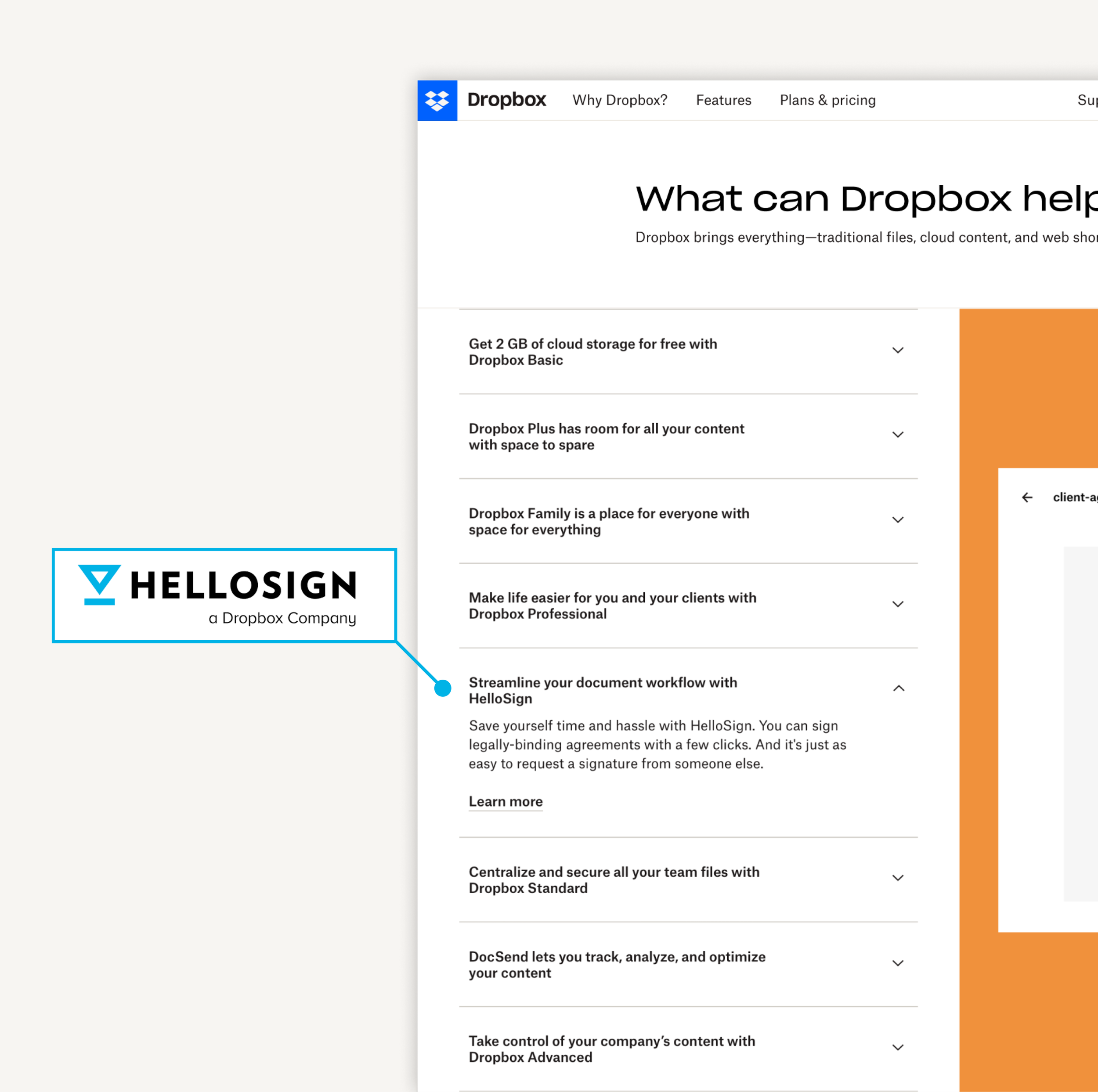
Homepage of Dropbox.com is a place for visitors to discover and navigate to product offerings.
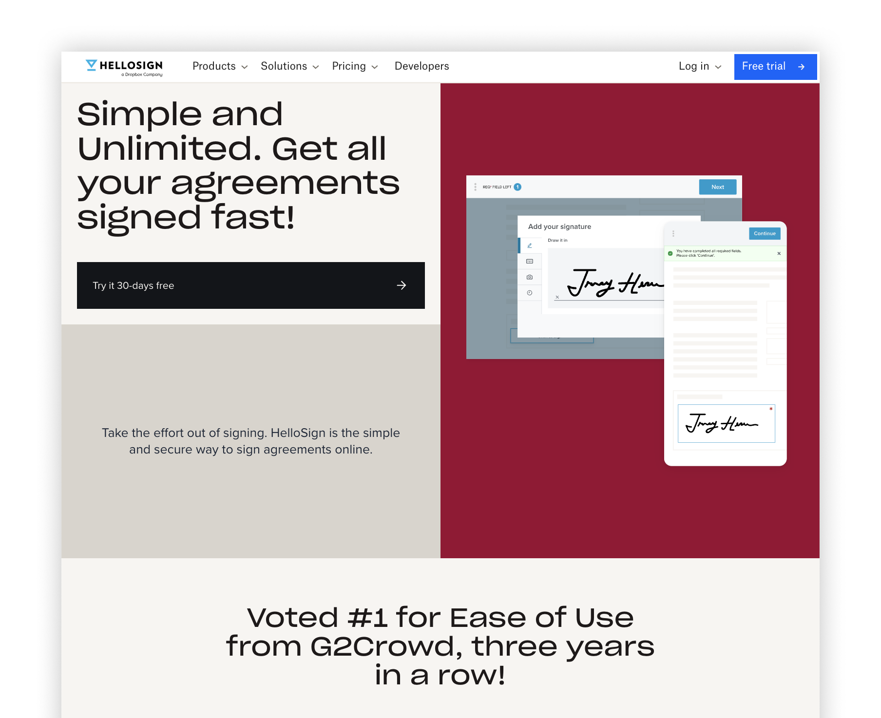
Dropbox has many new product offerings including HelloSign & DocSend that are displayed in an accordion user interface.

Dropbox.com (homepage)
PROBLEM
It is hard to discover & engage with these new product offerings
The accordion user interface on the homepage that displays product offerings is complex and hard to use. It requires a user to consume a lot of information and click multiple times to engage with each product.
Data Analytics:
Level of engagement is dependent on the order of content. (example: Product 1 gets more engagement than product 2)
OPPORTUNITY
Design a simple & engaging user interface that can house any product
For the first experiment, we will enable visitors to discover HelloSign & DocSend.
GOALS
Leverage AB Testing to uncover the most ideal product discovery experience for new product offerings.
1.
Increase CTR to product information
2.
Increase Conversion Rate
3.
Decrease bounce rate
4.
Decrease time spent on page
DESIGN PRINCIPLES
Engaging.
Capture the attention of the visitor to discover this new product offering.
Empowering.
The visitor should feel empowered by the content shown to make a decision to learn more about the new product offerings.
Intuitive.
The visitor should understand clearly how to make the next step to learn about the product with hesitation.
Scalable.
Design a system that can be applied to other new products Dropbox will offer in the future.
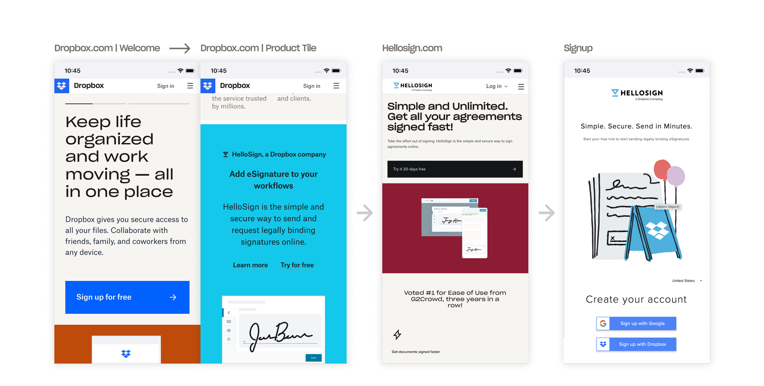
USER JOURNEY
We mapped out the user journey to ensure every touchpoint of the product discovery experience was engaging and empowering.

DESIGN ITERATIONS
Concept Explorations
I explored various designs in how to offer visitors an engaging and scalable way to discover new product offerings. These explorations included considerations to brand language / UI kit, responsiveness from screen size to screen size, and static content vs. interactive content.


UXR
Experiment Design
After many explorations and reviews, we narrowed down to two variants that we decided to run for AB Testing.
Control
The existing homepage.
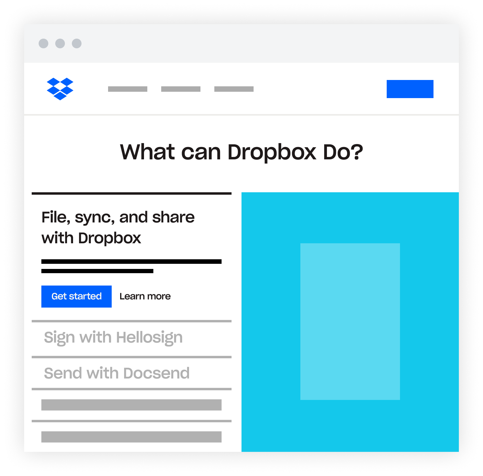
V1 | Single Product Tile
The HelloSign product tile will be stacked on top of the DocSend product tile.

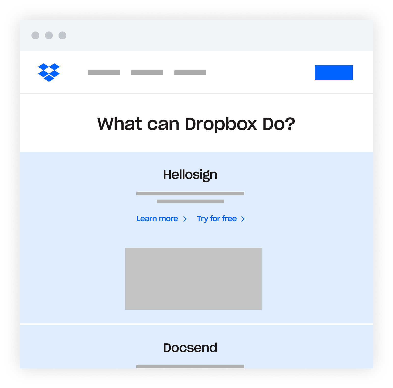
V2 | Double Product Tile
The HelloSign product tile will be next to the DocSend product tile.
FINAL DESIGN
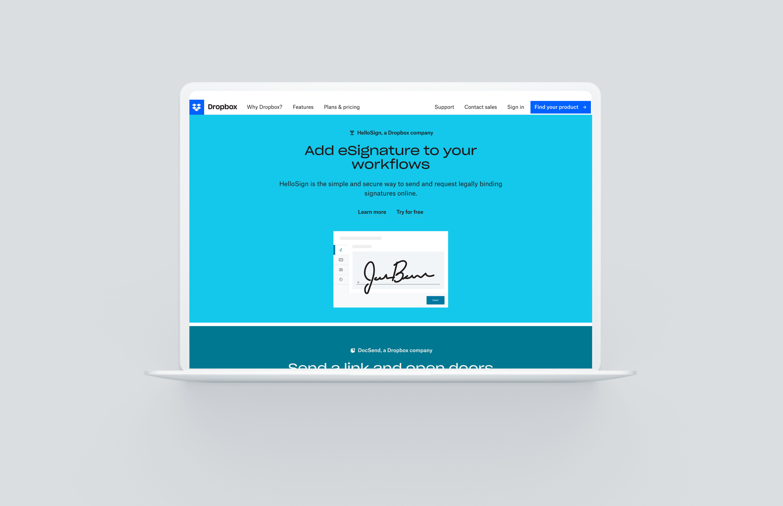
Product Tile
The Product Tile is a scalable UI system that can display any product that is in Dropbox’s portfolio on any page of the website. It has an array of color options that make each product pop off the page and engage the user. The entire product tile is interactive and a user can click anywhere within the tile to engage with a product to learn more. Finally, the Product Tile has the same exact design on Mobile as is does on Desktop which is great for the end user experience and great for internal management.

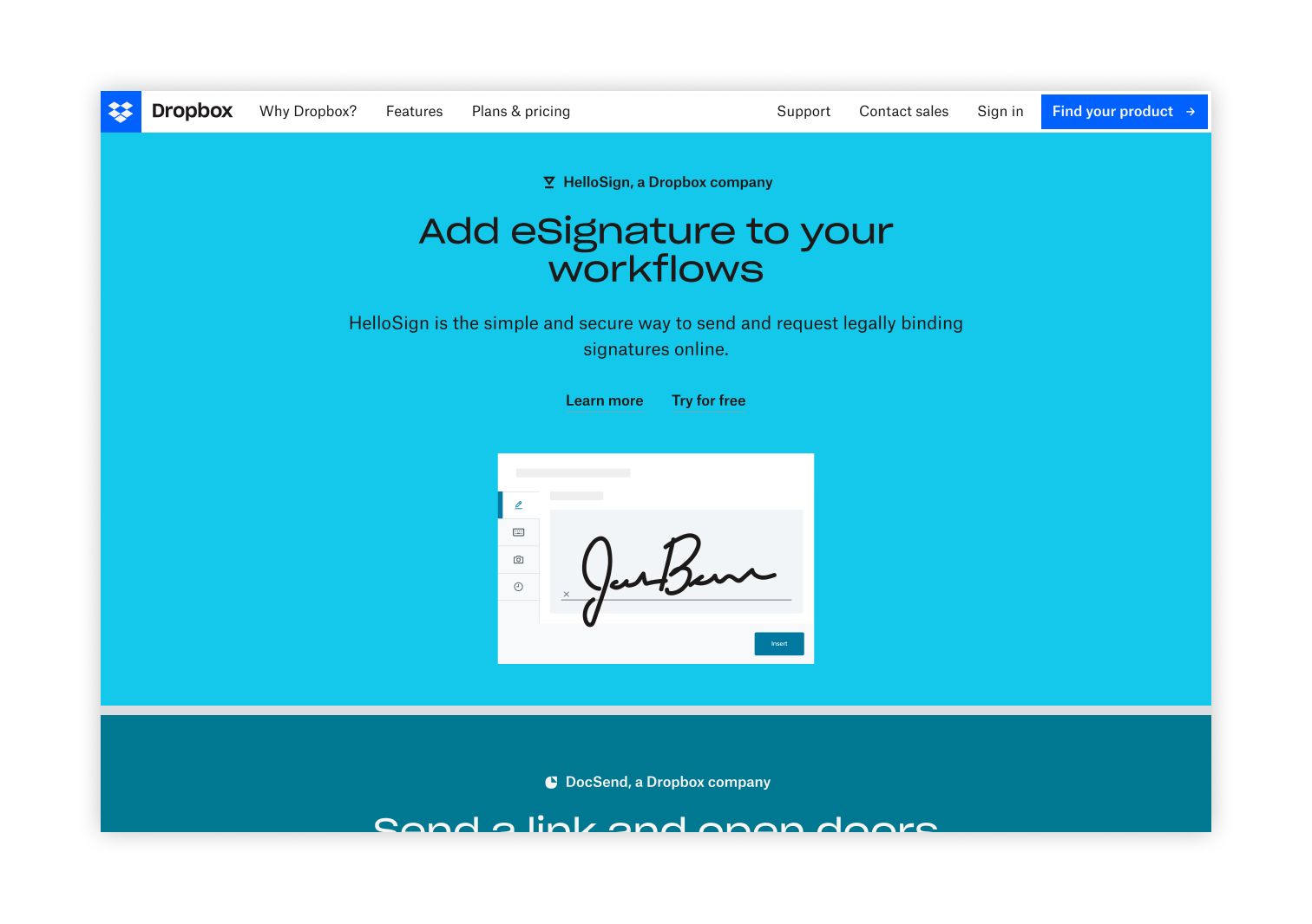
V1 | Single Product Tile
The HelloSign product tile will be stacked on top of the DocSend product tile.
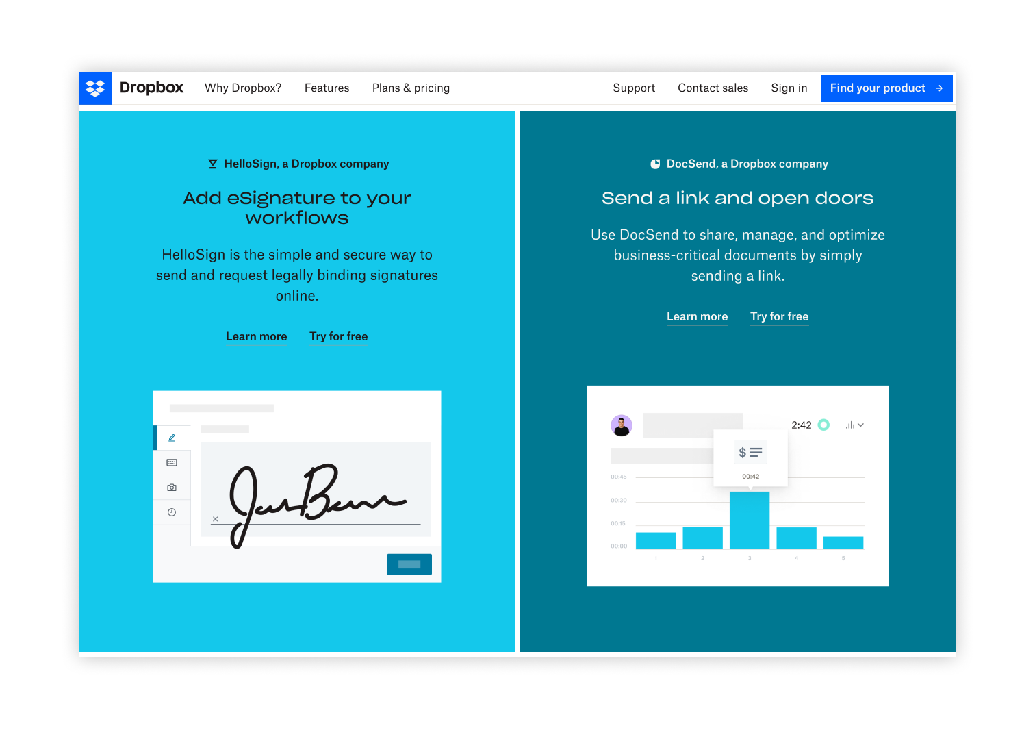
V2 | Double Product Tile
The HelloSign product tile will be next to the DocSend product tile.
Baseline UX.
When a visitor first arrives at Dropbox.com, they will see the welcome message and scroll down to discover the Product Tiles. Once they have chosen a product to engage with, they will have the opportunity learn more about plans and choose one to checkout with.
TEST RESULTS
Product Tile enabled more visitors to discover the Hellosign & Docsend offering
The two variants were tested across 20% of Web traffic for 60 days to understand which variant inspired more CTR and CVR to the HelloSign & DocSend. The Single Product Tile orientation was more successful than the Double Product Tile.
Increased CTR to Hellosign by 20% & Docsend by 12%
Increase Conversion Rate of Hellosign by 6% & Docsend by 2%
KEY TAKEAWAY
Interactive Product Tiles are a good mechanism to enable visitors to discover new product offerings
It was found through the experiment that the Product Tile improved success metrics. Executive leadership decided to push the experience 100% live to the general audience for both Desktop and Mobile. This decision was grounded in the insight that having a Product Tile enables visitors to discover and engage with new product offerings quickly and easily when they first arrive at Dropbox.com. This can scale well when new products are announced in the future.
